Traverse
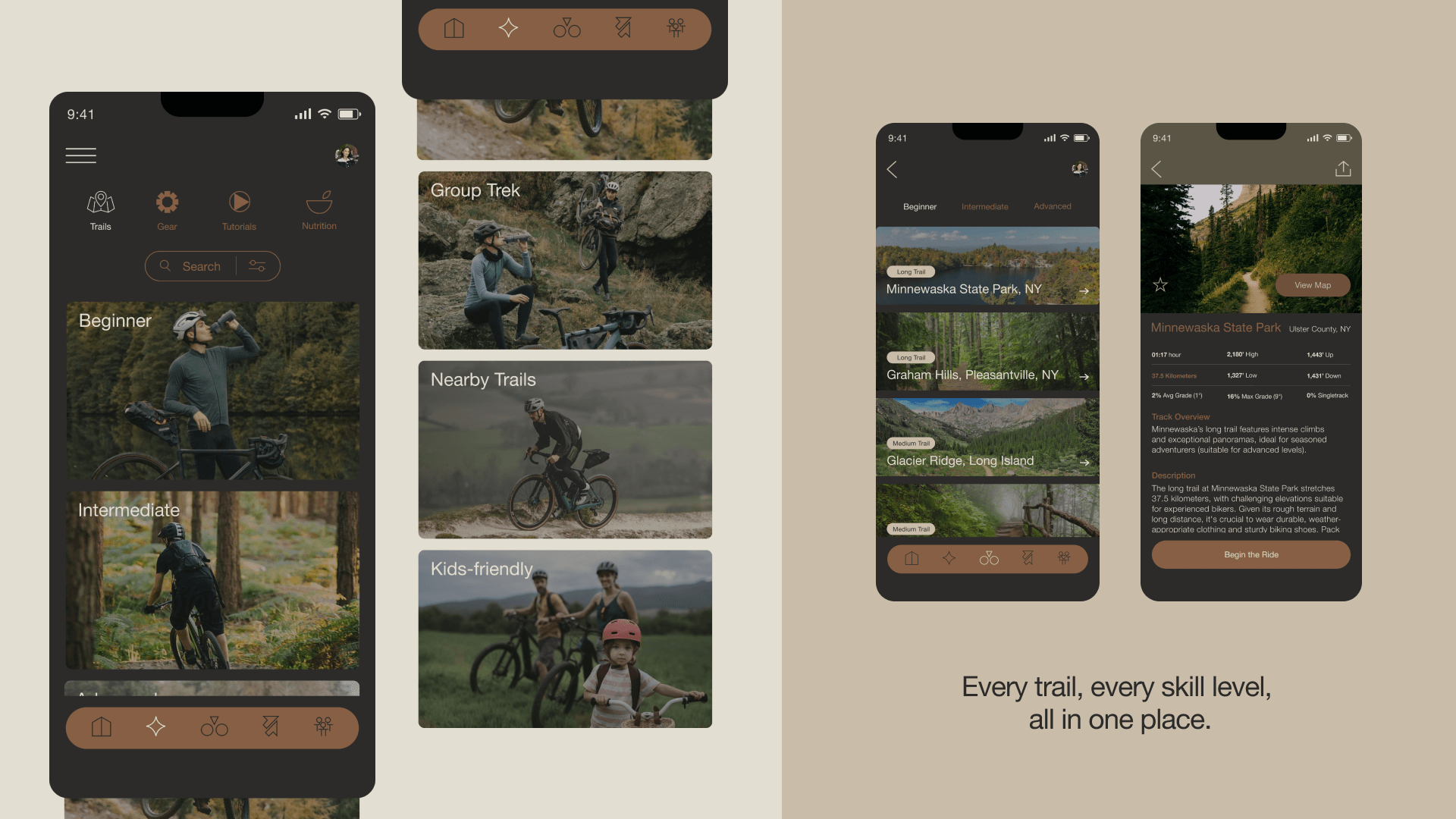
Traverse was designed with all levels of riders in mind, especially beginners. The priority was to create a user-friendly interface that simplifies navigation and enhances the overall biking experience. The branding of Traverse reflects the essence of mountain landscapes. The logo symbolizes the dynamic terrains riders encounter, while the earthy color palette evokes the natural beauty of the outdoors. This blend of thoughtful design and functionality ensures that Traverse is not just an app but a seamless extension of the rider’s adventure, merging digital ease with the spirit of exploration.
This project was completed as part of a school project at Shillington
Project Date
2024
Project Type
UI/UX Design
Brand Values
Adventure | Experience | Community


